
Loading...


To kick off the project, we met Mike Tan, CTO of Changeheroes.ca. Change Heroes is a web-based platform where people can raise money for their favourite non-profit organizations by sending personalized request videos to friends and family.
They were testing a new version of the their current product. Specifically the donation campaign creation and management experience. As the founders considered technology options, they realized the benefit of prototyping out a solution with a UX design team. They wanted to know if a native mobile app could better support the creation and maintenance of a campaign. As well, meet the following business goals:
Our discovery direction was to uncover these questions:
We conducted:
Organizational transparency is paramount.
When deciding to donate or volunteer for an organization, the most important thing we heard from participants is transparency of financials and work. We saw a trend of mistrust growing with foreign-aid organizations. Some expressed that their reservations grew the larger the organization became.
Administrative costs are not the issue.
The people we spoke to understood the need for administrative costs. However, when messages are “sugar-coated”, or financial model unclear, and/or hidden, they are quick to jump to negative assumptions. For example, I asked testers a comprehension questions after they naturally investigated the website. When they later learned that Change Heroes was a for-profit company, the testers were shocked, and their desire to donate diminished.
Give us choice!
People would like to choose how they reached out to their contacts, as a video ask might be uncomfortable for some, or impractical. For example, our users said for close friends they’d prefer to call or text.
With technology allowing information to be so accessible, millennials want to be effective altruists and have the company information be pushed forward with pride. If an organization is confident about their choices, the donor will probably be as well.
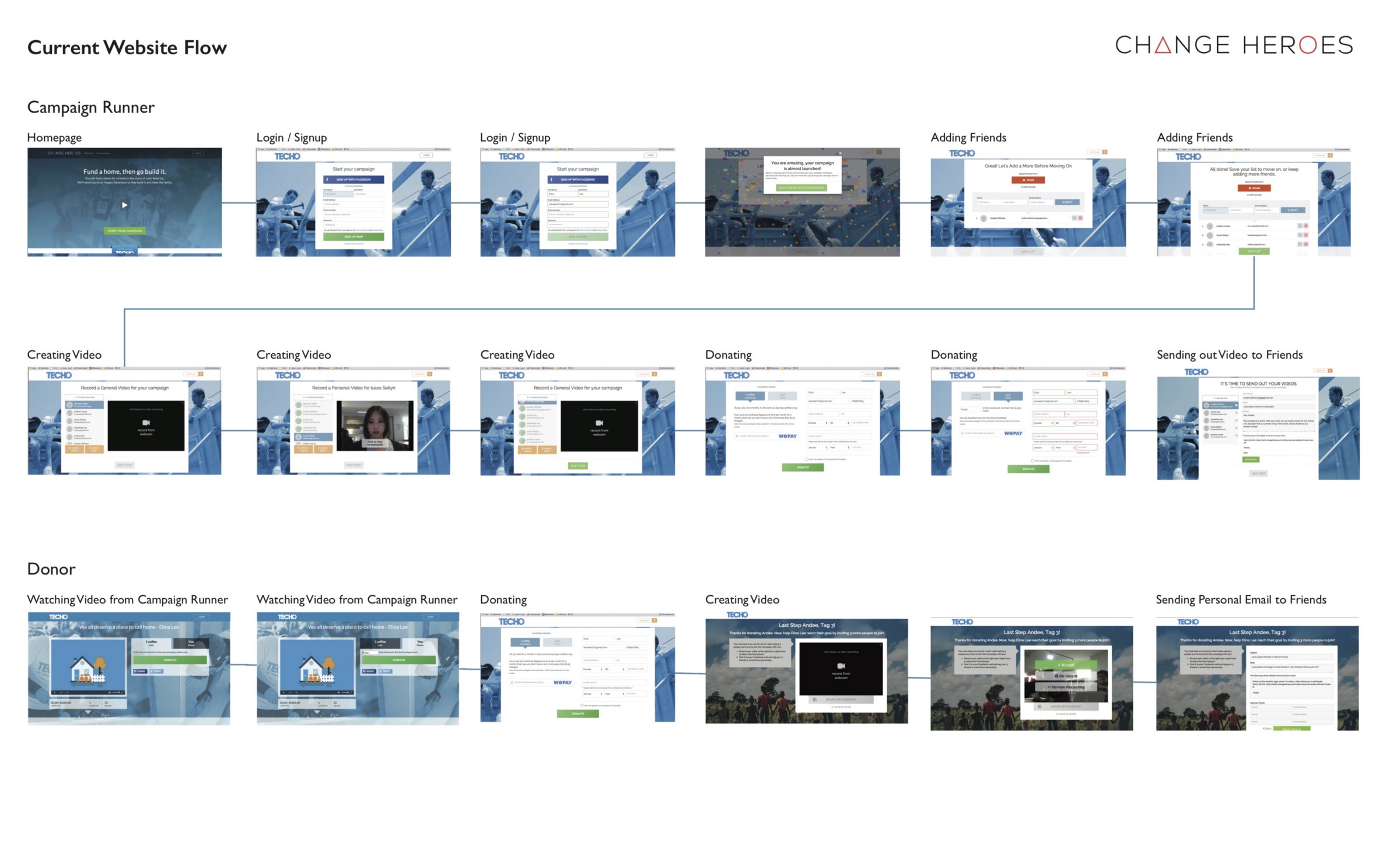
Current work flow:
Once we planned our feature requirements, we confirmed a native mobile app was the best technology to use. SMS capability, seamlessness, cameras, everything about native mobile at this time would better support the goals of creating and managing a campaign. We also considered the experience of the donor side.
Campaign creators need a simple app that allows them utilize the power of mobile to seamlessly ask their contacts for donations in the most successful way, comfortable way. This is because our users vary widely on technical ability, do not desire to give a lot of time to running a campaign, and want to leverage personalization over video.
We discovered from Google Analytics that most traffic to the web application came from desktop.We planned for our primary users to learn about Change Heroes and the process, and then start a campaign. When finished the campaign creation on the web application, we would then prompt them to download the app for campaign management. This would be the main screens we would design and prototype for Change Heroes. Expanding our scope meant we could achieve consistency throughout the experience.
Use cases and stories
We uncovered all the use cases for campaign creation. From these we crafted user stories.
User flows
At the same time, we started mapping these journeys into technical steps and relationships.
Feature prioritization
From the user stories, we determined the features needed for completion. Our scope was to deliver the entire UX from web site to a user's successful campaign. With three weeks, it was less about prioritization, and more about dividing and conquering. We collaborated on the initial sketches, but then found a way for each of us to take key parts of the journey. I worked on the campaign creation work-flow.
Information Architecture
Information and speed meant a lot to the user. This made for a juggling act for determining our information architecture. We decided to work it out through a quick, iterative design phase.
Leveraging progressive disclosure: We designed campaign creation that took the user step by step for the input of only necessary details. We removed the step of adding friends to after the campaign had been created, from the campaign management dashboard. We also removed the need for a profile picture.
User Autonomy: With giving the user more “ask” personalization options, came more complexity in the design. What would happen if a creator didn’t want to send a personalized video, but simply a text? Where would they arrive when they followed the link? Our team decided they would see a general campaign page, with a general video. This could cover asks for a user’s outer circle.
As predicted, labels and informative copy proved problematic with our initial design. Our challenges were to ensure users knew that Change Heroes was only the fundraising platform, not the charity!
There was also confusion around the general campaign page versus the personalized video page. We determined we needed to introduce the instructions contextually in the user’s journey, instead of all at once in the copy. Through rapid design and iteration we were able to find contextual places to put instructions.
We ended our design phase with a good prototype that achieved our design goals. The app was to be developed throughout 2016, however, the production ceased in 2017.
This project was really meaningful to me. This is why I came into UX: to help make a difference by improving how we share knowledge, and to understand people and how to engage them. I was grateful to engage in conversations about changing the world, and what it really means to be a hero.
On this user experience design project with me was: Elina Lee, Andres Navas, and Lucas Sellyn.


Version 1.0, last update 12/12/19

