
Loading...


Problem statement:
How might we enable recreational drone pilots to confidently conduct their first site survey?
What we started design with, from discovery.
Business goals:
User goals:
Product goals:
Desired product outcomes:
Design constraints:
Initial concept work
We started with three possible product concepts to address the problem statement above. By looking at three different directions, we could get an early sense of technical feasibility and business appetite. Often in product design you pick a direction and refine the concept based on user and business input. However, we cycled through the concepts as we uncovered blockers that prevented the direction from being viable. Working with agile methodologies allowed us to make these pivots that would have otherwise caused our project to fail.
To facilitate conducting a site survey by pulling resources together and allowing users to input and organize their research work. Offline capability would enable users to have their site survey work offline, ready for inspection if needed.
By taking care of the leg-work of users, we could make the process easy, going beyond our goal of manageability. The goal of any product is to take care of as much work as possible. Starting off by exploring the most facilitative option would allow us to sculpt a solution from the ideal state.
What we found:
1. Unable to pull essential data from NAV Canada--NOTAMS and METAR in the timeline of the project.
A key regulated step is checking “Notice to Airmen”, or NOTAMs. These are daily notices that inform pilots of anything that could impact their flight. An example would be a flight plan from a private citizen, or a new restricted airspace enacted for emergency responders in a natural disaster.
NAV Canada is a non-government organization that owns all airspace in Canada. Selling airspace data is a key revenue generator, and the type of commercial license we would need would be in the tens of thousands of dollars.
Even if we justified the expense, the data is not user friendly. When looking into how we could change that, we found that there was no possible way to “codify” the data to only include what is relevant, and translate it for non-aviation folks.
Solving NOTAM’s with our tool would be a massive under-taking, and one that seemed to be too risky to pull off in a 9-month project.
The same finding applies to METAR data, the standard weather data pilots are required to reference when assessing weather conditions. However tools already exist to translate METAR data into plain language, unlike NOTAM data.
When asking if it’s essential for users to check METAR data versus the weather network, for example, we ran into the friction between legal liability and practicality for uses. We talked out the scenarios for using an alternative source of data like the weather network. If a user caused an accident due to weather, they could be held liable as they did not check the source regulated in the Canadian Aviation Regulations, NAV Canada’s METAR data. Therefore if a tool provided by Transport Canada used alternative data, the liability would fall to Transport Canada. There could be no “bending” the rules with stakes this high.
2. Google Earth is essential and a predominant tool in the process… can we handle it?
Through our prototyping with the team we uncovered that the majority of the research and planning of a site survey needs to happen on a geographical information system, or GIS. The most popular and free option is Google Earth. If we were to facilitate the site survey, we would have to replicate Google earth for one third of the product.
The technical complexity to do this meant that it would likely take the entire time to build. Wanting to have a minimum viable product released by the end of the Fellowship was important to us. A map that simulated Google Earth would not be a true minimum viable product. Without the whole site survey facilitated to some degree, it would not meet user’s core needs.
Even if we were able to complete an MVP, with the sheer complexity, is it realistic for Transport Canada to continue building and maintaining? Working alongside a digital service developer we were able to get a picture of the likelihood of being maintained and developed--outcome didn’t look good. Capacity is limited, and many developers are using a different programming language.
3. With other tools handling these key steps, are we duplicating effort?
Three of the core pieces of a site survey already exist. So what’s the problem with users succeeding to use them? With regulations published, and a scope of a site survey, we could return to user research to find out what the real challenges are for our users to conduct site surveys.
We had a hard deadline to define our MVP by the end of the sprint. Which meant that any research at this time needed to be quick and efficient. I reached out to past user interview participants to see if they would be able to participate in a diary study in the timeline we outlined. 2 participants said yes. Although we understood the sample size was small, we had a very specific focus. We decided to run the diary study with 2 primary users, knowing that anything they did would give us more insight into how real drone operators would attempt this new process. User research is the art of good enough.
“I consider that the participant failed mostly because they decided to eyeball the general dimensions of the area of operation. Topographic maps, scale diagram and satellite imagery all have the particularity of having a scale, thus estimating the distances are fairly straight forward from that point. Also, I would have appreciated some reasonable thinking relevant to why he chose the present dimensions.”
- Transport Canada Inspector
With these findings we decided to look at how we can be the template these users desperately need. We asked ourselves, “How can we provide a template for a site survey that enables good decision-making?”
A structured template that would provide guidance to specific tasks of a site survey. This would enable users to know exactly what to do, and how best to do it. We framed it as a “Companion app” to tie resources together, provide instructions and guidance on all aspects of the regulations. As well as be an offline tool for having what you need in the field no matter where you are.
Wireframing digitally gave me the ability to imagine possible interactions within a typical checklist format. I used standard material design components to keep the design at a medium fidelity. I used InVision to stitch screens together to illustrate functionality. We showed this to our stakeholders to get initial feedback. The response was mostly positive, but there were concerns with signals given by checking something off. The fear is that it could lead to false positive of compliance, and lawsuits.
The usability study design influenced what parts of the prototype to keep, and what to add to augment the experience of navigating to a different tool.
The design of the usability study tested the tools ability for users to make a correct choice of where it is legal to fly using our product to guide them. Users were tasked to:
The new Where to Fly tool had yet to be released, but we had early access to see what was to come. I stole screenshots from the tool so that we could simulate the experience of using the tool without users having to use it. We also created a document we could share if users wanted to use the Canadian Flight Supplement or Designated Airspace handbooks. Read all test design details here.
The first checklist item in the tool was “Create a file where you will keep all the details of your research and surveying.” All users were thrown-off in some way by this. They either were confused, checked it off thinking they didn’t need to do it, or thought that by checking the box, you are enabling the functionality. When users reflected on their experience, they wanted to the tool to be the file we were asking them to create.

2. Participants had a completion mindset, not a learning mindset.
Order of information was very important to the success of actions taken. Participants typically skimmed headers and first lines, but didn’t fully read until they were stuck. They all used tools in the order that they appeared. In the initial prototype, the Canadian Flight Supplement was listed as the first resource. Instead of reading both options, they used the first option, even though it described the CFS as an advanced aviation document.
3. Participants checked boxes even if they hadn't done what was explicitly being asked of them.
They used their own judgement to determine completion, versus following the app's direction. The more experienced participant maintained his own process, using a tool called Airmap to determine airspace. There was a discrepancy in the map, and participant missed identifying the caution space.
This made us consider Transport Canada’s false-positive/liability concerns even more heavily. If users weren’t even doing the things they were checking off, how could we argue that the tool let us know that they tried.
Before entirely giving up on the checklist concept, we investigated how to better accommodate storing user’s work. If we could do that, and put more focus on information architecture in the guidance, perhaps we could address all of the findings.
When we started looking at the offline capability of storage, we found a limitation. We found that we were restricted to storing 50mb of data offline. Which meant if you wanted to take your work out into the field with you, you would need reliable internet to maintain access to it all.
We also didn’t think that we could solve the mindset of users. We saw that the real need is education, yet a checklist is prioritizing completion. Even with a redesign of architecture, we would fundamentally miss prioritizing the main need of users.
Given the solution is educational in nature, we decided to focus on an educational experience, and abandon the potential liability of a checklist.
Focus the user-flow and information architecture around learning how to do a site survey. This way we could enable users to use the tools they wanted, and avoid missed expectations of tool functionality.
About BOPPPS model
The BOPPPS model is used in designing lessons for experiential education. If you google BOPPPS model, you’ll see almost every Canadian university has it listed as a resource for it’s instructional staff. It stands for:
B - Bridge-in (Introducing the why behind the lesson.)
O - Objective (By the end of the lesson, the learner should have learned this.)
P - Pre-test (Assesses the participants current knowledge.)
P - Participatory learning (Activity-based, group-based are strong choices for learning mechanisms here.)
P - Post-test (Assesses how the learner has met the objective.)
S - Summary (Concludes learning experience.)
The BOPPPS model enables clear, active learning planning and measuring, with studies to prove it. It’s primary use is in teaching trades, as learning practical skills demands active learning. This is why you’ll see “train the trainer” courses, like the Instructional Skills Workshop, preach this lesson-planning model.
Given our users need to learn practical skills in an engaging way, we approached our site survey lessons with the BOPPPS model.
Internal usability - “cafeteria test”
We didn’t have much time to test our educational pivot, so we designed a way to test with people in the building. We walked around the cafeteria and provided people with a link to a prototype and a survey that asked:
We received 18 responses.
Findings:
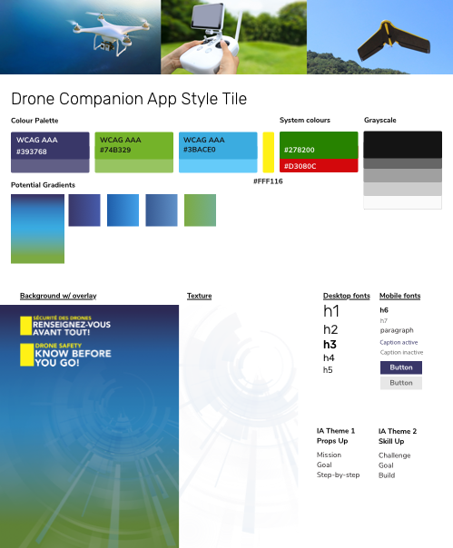
After iterating, we were able to add a visual layer to the product and update the UI to ensure accessibility. We took the Drone Safety branding and created a style tile. The branding was intended for print material, so I would need to adapt and select brand elements for accessibility on the web. I explored many versions before settling on a tertiary colour scheme using the purple-blue at the top of the drone safety gradient to use as a primary colour. The combination of purple, lime green, and Nunito Sans gave an energetic, youthful vibe. Considering our tool could be used by youth as young as 16, we thought this youthful style would help with the feelings of manageability and motivation.
We’re a progressive web application, which is a native-seeming web application. So do we follow the native application standards? Or the web application standards? Also, what of Canada.ca standards must we follow? Navigating these three sets of standards was difficult. At first we explored bottom navigation to more closely match a native application experience. But once we looked at the Canada.ca standards, we realized we would need the standard header and footer. This pushed us to design more like a web application. Although we would love to further explore how to leverage the native experiences that a progressive web application allows, for now, the product goals are achieved by following the web standards applied to web applications.
To read further into the visual design and interface process, visit this case study.
We all worked hard to build a product in few months. I contributed the styling to the components, our government partners did quality assurance, and our developers coded. It was complete just in time for the Code for Canada showcase!


Version 1.0, last update 12/12/19

