


"The most exciting breakthroughs of the twenty-first century will not occur because of technology, but because of an expanding idea of what it means to be human."
I was fortunate to take Simon Fraser University's Radius Fellowship on Radical Doing. It was a six-month program where we developed leadership capacity alongside our social change projects. My project was about exploring the possibilities of communal design. I wanted to develop a design network that made co-design, design thinking and innovation activities accessible and available to all.
How I would do this? Through capacity building with social innovation champions in my community and around the world. If I could demonstrate the ability to balance business and user needs with the needs for social and environmental equity, the change I wish to see in the world could begin to spread. User-centred design is just the beginning of a cultural shift benefiting democracy and technology innovation.
You can learn about my first projects completed under Teal Strategies in my case studies “Restore Human” and “Leverage Labs”. This case study, however, will focus on the branding of Teal Strategies, the name of the business I would register to begin this practice. Through branding I explored why co-design was important to me and the world, and how I would try to best communicate that.
I asked a friend and fellow designer, Graham Black, to facilitate my first visual exploration for me. We used the design inception wheel we learned at RED Academy. Starting with “Why?” we work our way out the mood or effect, then the visual elements. I wanted the ideation to start with a conversation, so I directed Graham to keep me talking about what I do and believe in, and take note. The following image is the result of that session.
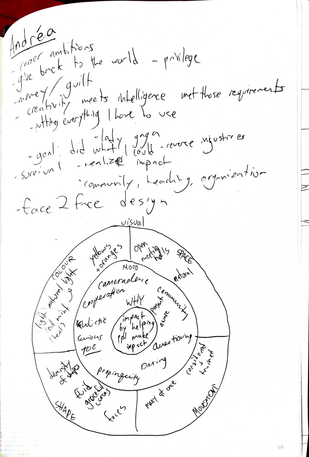
Although I was initially happy with the output, after a week, I realized it needed another pass through. It needed some self-facilitated work through imagining the work and its metaphors. I decided to create another wheel on my own. I had a new iteration of my “why”.
I went from “impact by helping people make an impact” to “creating access to design practices that involve and advance humanity.” I wanted to highlight accessibility in my “why”, and tie it to the outcome I wanted of the practice.
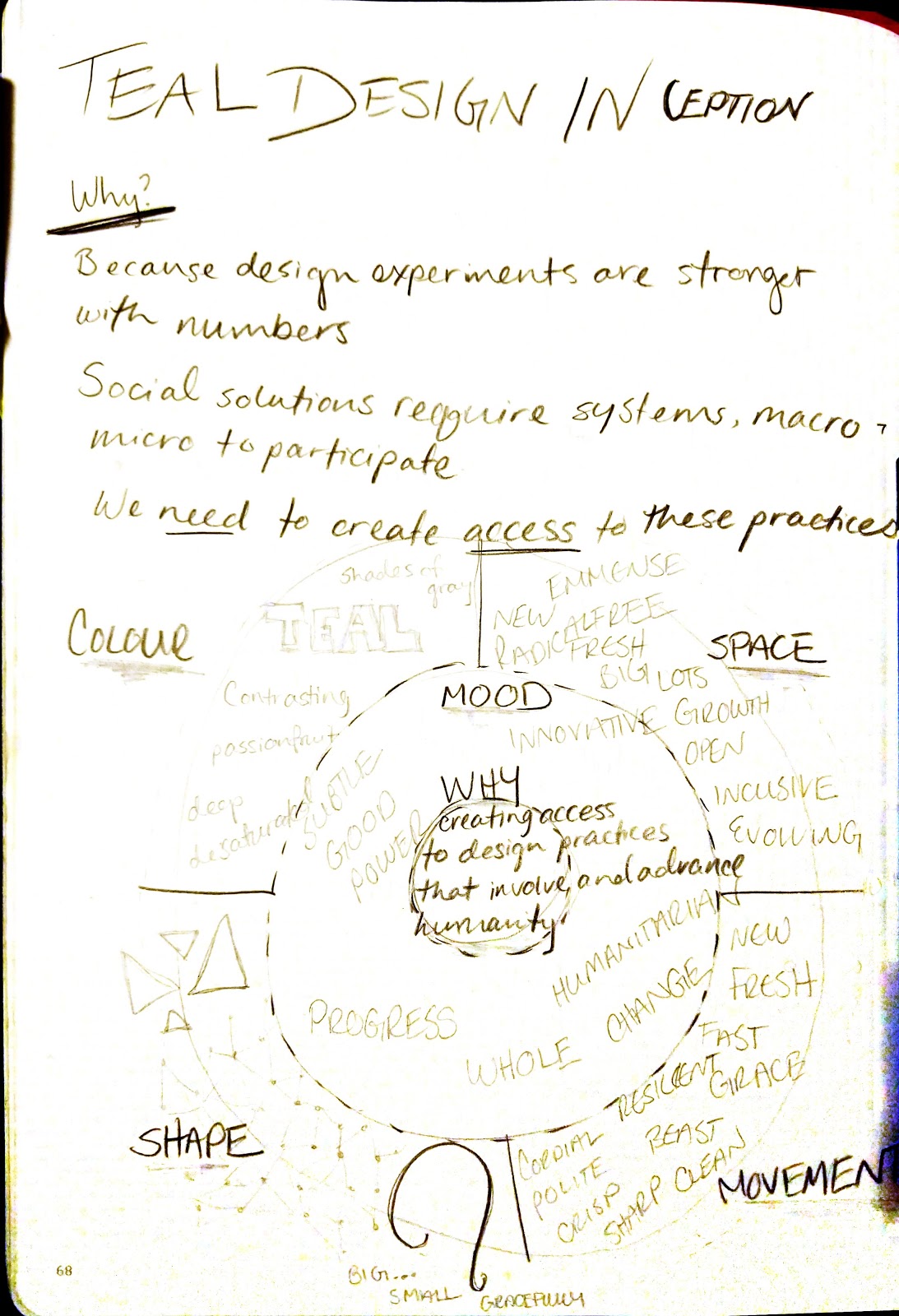
To me, teal felt like a new structure, so I jumped to triangles. The metaphor of “change” was symbolic to me. It’s also the most simple shape that provides dimension. I believe design is a constant balance between reality and idealism. But the goals are simplicity and purposefulness. The triangle serves it’s purpose well in our world with only three sides.
I was obsessed with Open Sans as soon as I started using Google products regularly. It’s described as having an "upright stress, open forms and a neutral, yet friendly appearance" and is "optimized for legibility across print, web, and mobile interfaces." [1] Created by Steve Matteson for Google in 2011, it’s intention was accessibility and relatability. This too was my intention with co-design. To involve people in their solutions as a way to design better, and keep solutions relevant to changing environments.
As an accent font, I chose Roboto Mono. It’s family, Roboto, is another iconic Google font for Android. I found that Roboto Mono had a modern look and feel as a monospace font. I thought a lot about the values of futuristic and presence. I wanted people to believe that these tools can change their businesses today, but also have a much larger long-term impact through sustainability. Roboto Mono balanced the long term and the short term, putting it all into perspective.
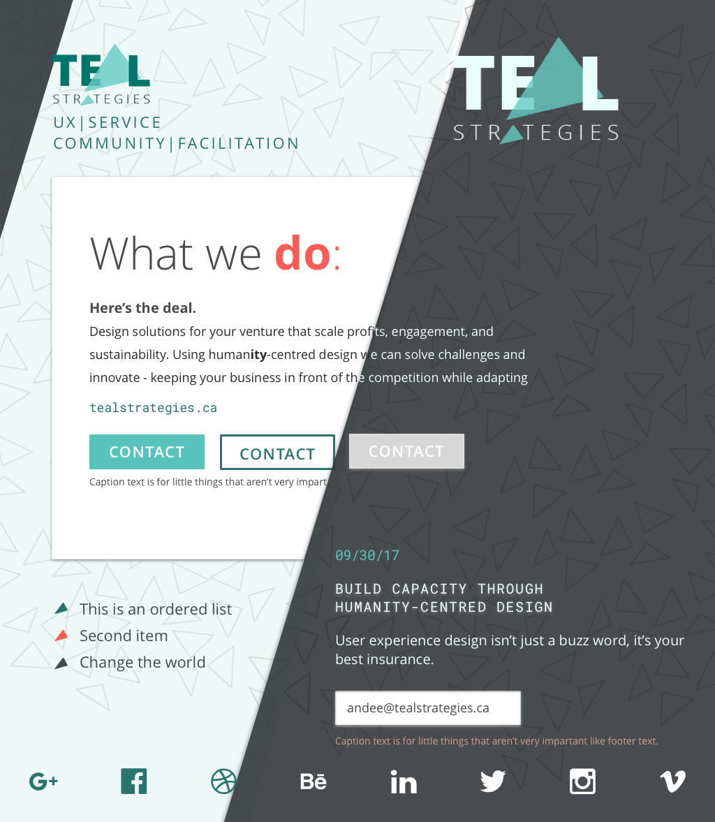
When I came back to the style tile after letting it sit, I felt a sinking feeling--my interpretation came out one dimensional and incomplete. Flat triangles and the literal colour teal as a colour palette took the stage. I realized I could be simple and still have dimension. I decided to iterate.
I took another focus on a secondary theme out of my design inception work: big and then small. It’s the motion I think of when I think of teal work. It seems like a big deal until you feel it, then it becomes a little, “oh!”. This was the experience I had when I first learned design. It was like a lightbulb went off, I had learned an effective, measurable way to solve problems for different entities with our modern mediums. And when we co-design and capacity building, we enable others to explore their problems and solutions effectively as well. We are all designers! And once we see that, we can adopt operational practices that will work for the collective.
I also believed that teal’s advancement was not about technology. It’s more about humans in the workplace as an evolved society. As I quoted earlier, "The most exciting breakthroughs of the twenty-first century will not occur because of technology, but because of an expanding idea of what it means to be human." - Frederic Laloux, Reinventing Organizations. Contrary to how we currently believe the most important thing at the end of the day is how much money there is in the bank, I want to argue that our process is more important than the work. Our self-actualization (and therefore collective good) is more important than the work. So I wanted to make “teal” bigger than “strategies”. To me, my purpose and philosophy are more important to share than the deliverables of design work.
I also was admittedly self-conscious about choosing Open Sans as my font. It was everywhere… was I going to look like everyone else? Would designers think I’m lazy? I, as a designer, want to come across as inventive and pushing the trends. Would choosing the most popular font on the web give that impression? I wanted to keep my themes of simplicity, modern, size transition, and find something new. Or make something old new again… I do love vintage.
My eye landed on Myriad Pro from the Adobe foundry. Myriad started in 1993 as a multiple master typeface, allowing compilers to render the font in 30 weight varieties. As Microsoft and Adobe pushed font rendering forward, Myriad Pro was born to serve the OpenType format the web embraced. It originally included thirty fonts in three widths and five weights each, with complementary italics. A “semi-condensed” width was added several years later, expanding the family to forty fonts in four widths and five weights each, with complementary italics. [2] There was something interesting to me about this relic of a font released in 1993 that seemed to represent the birth of the commercial internet as we knew it. I decided to play with the contrast between this past with the future of teal organizations. To me, this was going to be a stronger metaphor than the modern feel I was previously going for.

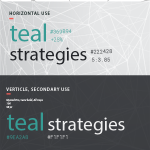
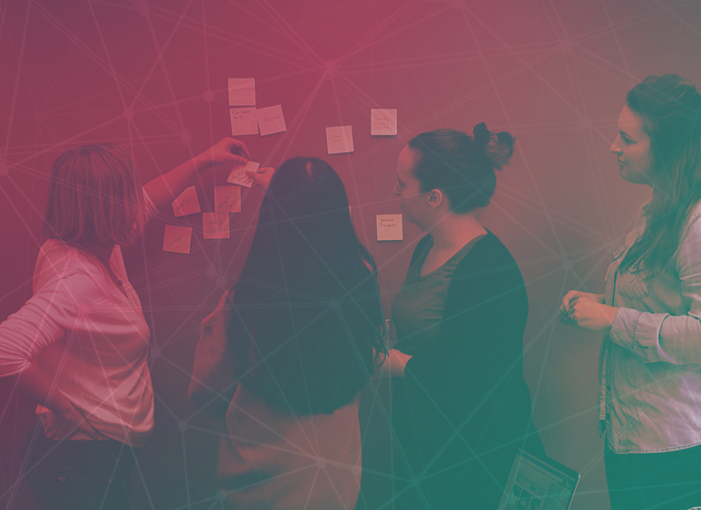
I would play around with images of work I did, adding textures and playing with more contrasting colours to teal. I tried to make more dimension with the triangles by connecting them into an intricate web, giving off the illusion of network and connections.
To see how the website would evolve to include this branding and communicate my work, visit it here at tealstrategies.design. I also made social media accounts to begin sharing and creating work that fell in alignment with the future of work and social innovation: twitter.com/Teal_Strategies, facebook.com/tealstrategies, linkedin.com/company/teal-strategies
As you might have figured from my low follows and posts, I have taken a break from Teal Strategies. This is to participate in the Code for Canada Fellowship where I get to take this work into government. That said, I am excited for the next iteration of Teal Strategies when I am able to focus on it again.
[1] https://fonts.google.com/specimen/Open+Sans [2] http://typedia.com/explore/typeface/myriad-pro/