
Loading...


What does WET 4, Aurora Design System, and fun have in common?
To answer this, you may need a brief summary of what these words are.
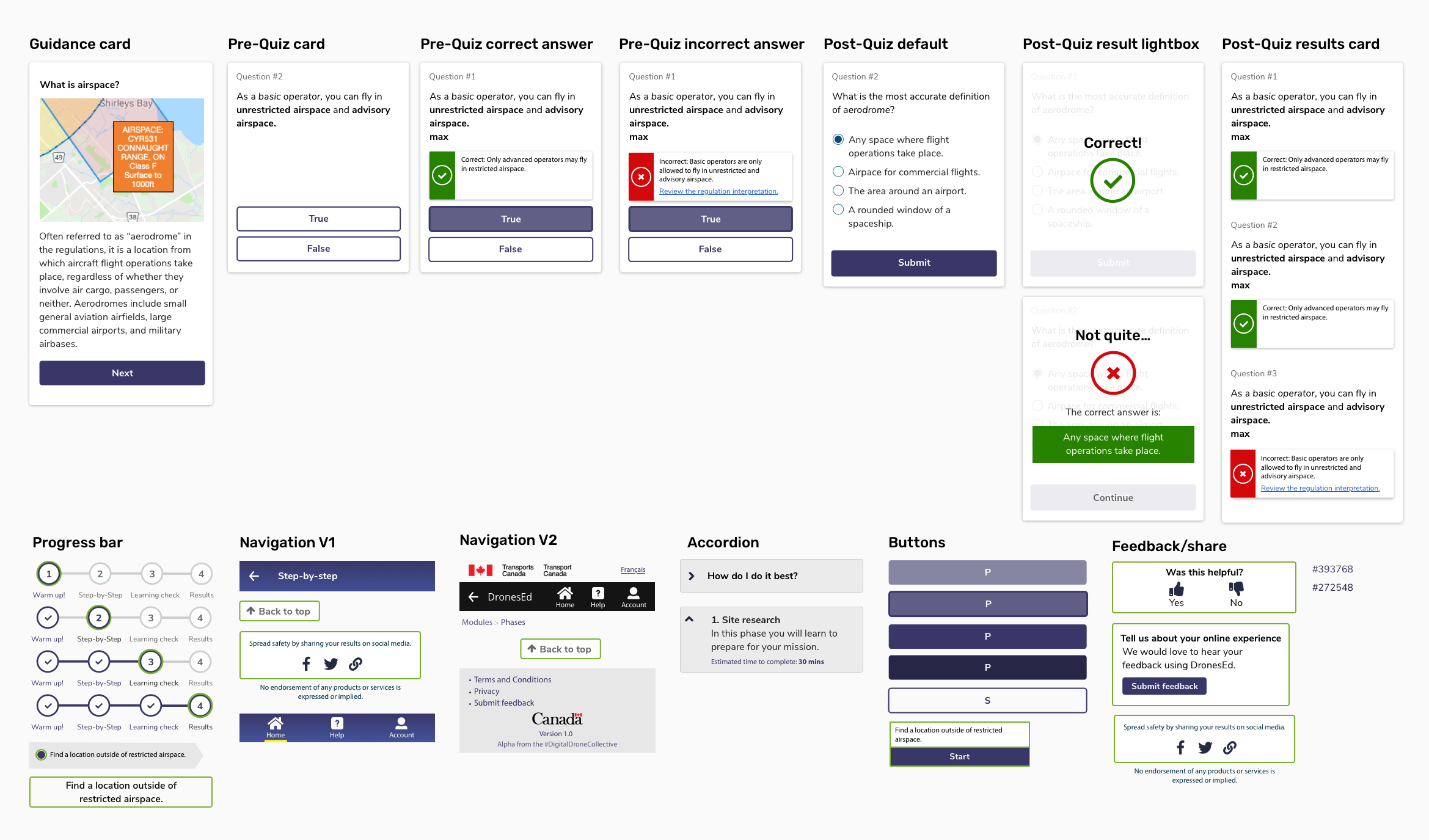
WET 4 stands for Web Experience Toolkit, version 4. This is what Canada.ca is built with. It's a bunch of standards and components that one needs to use in order to be hosted on the Canada.ca platform.
Aurora Design System is an alternative to WET 4 that builds upon the government standards to leverage modern web application technology. It's based on Material Design principals--only with a nerdier look.
Fun is that thing I used to have as a kid before I knew what global warming was...
Anyways, my answer to what they have in common? Not a whole lot other than pre-built accessibility. But I was determined to find a compromise of everything that met the standards of government, used the pre-built components available, used the branding of the new drone regulations, AND leveraged visual communication to facilitate the intentions behind the product. I wanted to make learning and safety from government less boring with colour and interaction. Our users could be as young as 16 and old as the oldest human can live. And these regulations are a big change for recreational drone pilots. Why not try to make it more enjoyable?
In the mid-fidelity stage of design, I chose to prototype using Material Design components. This was because Aurora was inspired by Material so much that they were essentially the same sans interaction. Also because I was using Sketch Libraries and Material Design has a great one that makes wireframing fast-which was important. We were already behind in our product development and the pressure was mounting.
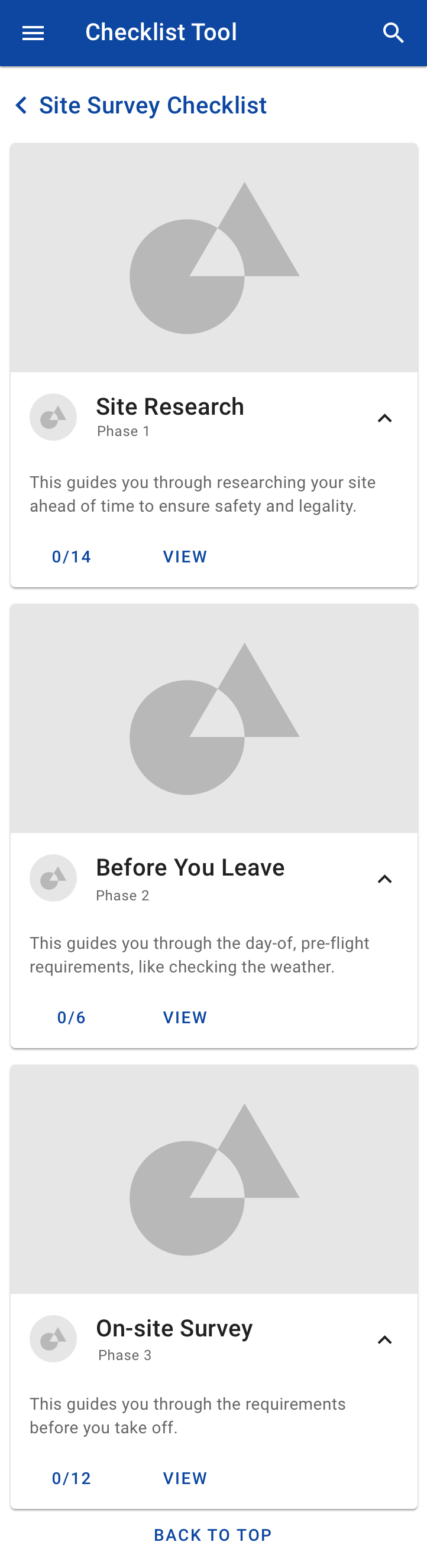
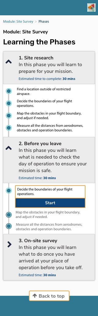
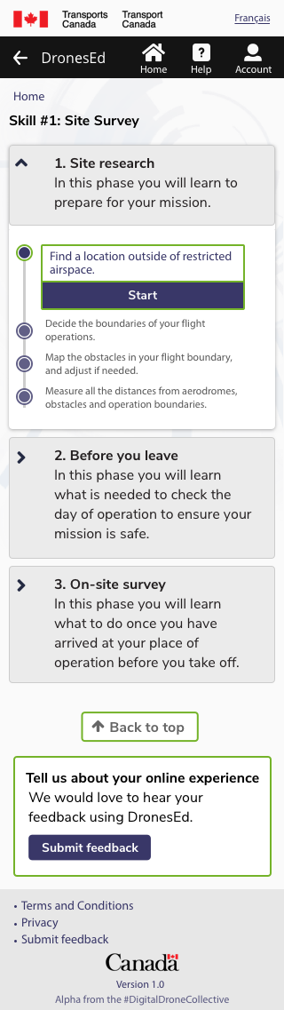
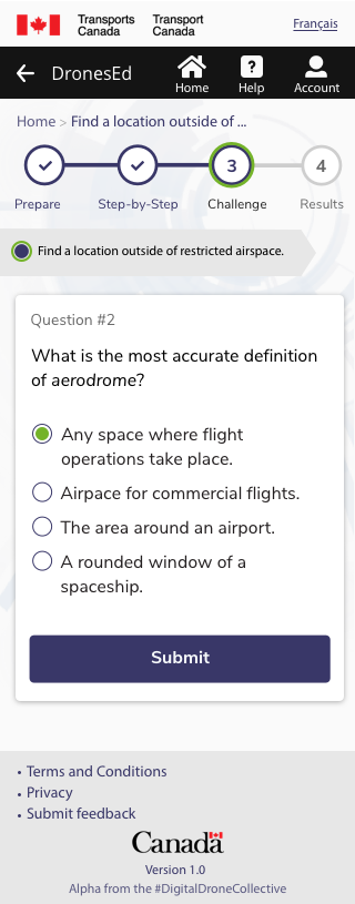
Through usability testing this version, we learned that a checklist wasn't enough. We learned we needed to focus on education, our primary goal, and design for that. We moved into a higher fidelity using the Aurora Design System to capture our new education-focused architecture.
We tested this, and found much better outcomes (read this case study if you're curious!) Time to add some branding.
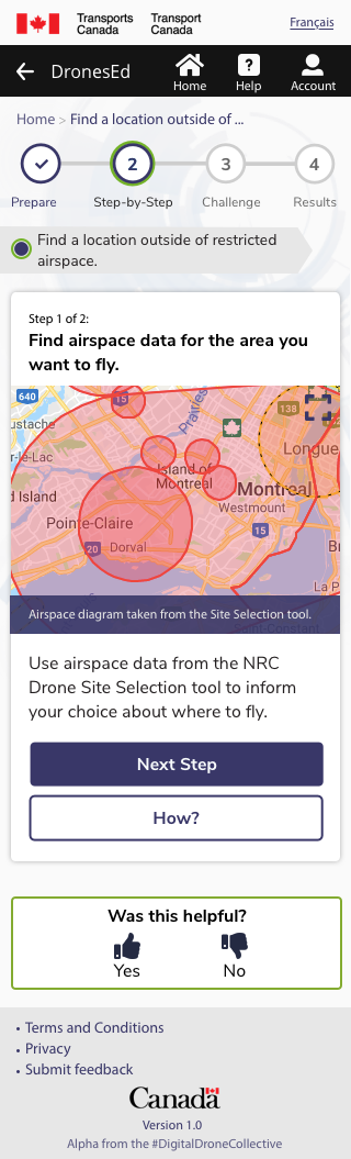
We technically built a progressive web application. For those who haven't heard of this, it's a web application that mimics native application design and functionality. So do we follow the native application standards? Or the web application standards? Also, what of Canada.ca standards must we follow? Navigating these three sets of standards was difficult. Initially in the design we had chosen a bottom navigation bar to match a native application experience. But once we looked at the Canada.ca standards, we realized we would need the standard header and footer. This pushed us to design more like a web application. Although we would love to further explore how to leverage the native experiences that a progressive web application allows, for now, the product goals are achieved by following the standards applied to web applications. To double check my rationale, I was invited to the Canadian Digital Service design team meeting to get feedback. They agreed with the design choices and affirmed that I wasn't crazy in thinking how difficult navigating all these standards was.
The Drone Safety branding was designed for printed materials primarily. As I dug into the style, I found the palette of grass green, sky blue, and bright yellow inaccessible in a digital context. I would need to pick a primary colour and rebuild the pallet based on this. I pulled together a first style tile. I explored several versions before settling on a tertiary colour scheme using the purple-blue at the top of the drone safety gradient to use as a primary colour. The combination of purple, lime green, sky blue and Nunito Sans gave an energetic, youthful vibe.
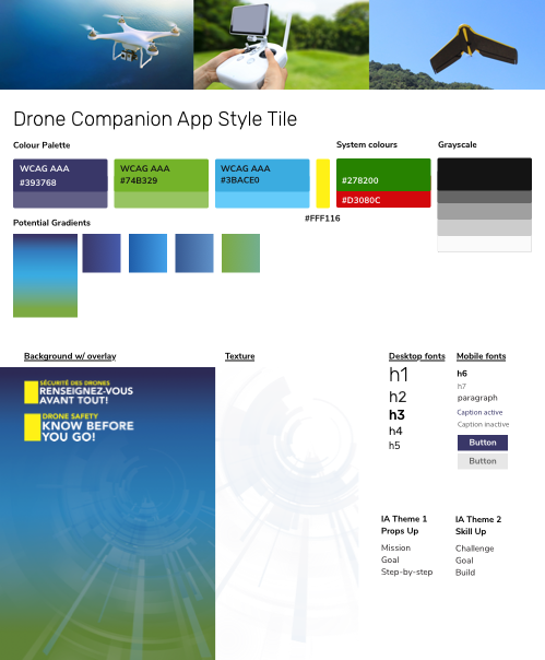
As I applied the colours to the components, I started to feel that the blue was jarring or distracting. The purple and green were loud enough. A third colour would be too much. I also saw that the orange from the base Aurora design was a much stronger compliment to the purple. Despite this, I knew trading orange for green would take it further away from the original branding, and likely wouldn't be recognizable. I stuck to my original plan.
If you're curious about how it ended up being implemented, the code is publicly available on GitHub here. Although I customized many of the components to match my design, I failed at using Github in the beginning. In the time crunch, I would end up sending my code files to our developers who would implement the CSS for me. Once we were tweaking, I was able to finally successfully merge without breaking our environment. This is an area where I want to grow my skillset further.
Your first time designing in government is an accomplishment. I was not used to working within such numerous constraints. From policy to personalities, government forced me to negotiate, compromise, and innovate. Which is why I stayed after this project. But not without some scars. Visually, I learned the design standards late in the process. I had assumed that as long as I followed the Aurora Design System, I'd be fine. But our partners wanted this tool to be hosted on the main website, and so this made me design into the Canada.ca standards. Had I been aware of this sooner, what this meant for our technology choices, I could have saved us an iteration and our developer might not have chosen the technology stack she did. By the end of the project, she felt like she had over-engineered the product. We created a long term to short term strategy for this product, so the product was built for scale. But as government standards, realities of internal capacity for continuation, and lean product development made leveraging progressive application difficult, the project fell flat for our developer fellow, Fatima Khalid. Our scope was large, which lead to more research, more discovery, more prototyping... we had to learn everything about how to do digital in government. Our strategy was strong and supported widely, but our dreams of finishing a public-released beta in 9 months were crushed by the size of our mandate. Our naiveté about the realities of government is a tool beneficial to illuminating transformation initiatives to governments. But heartbreaking when you didn't think it would be that hard.


Version 1.0, last update 12/12/19

